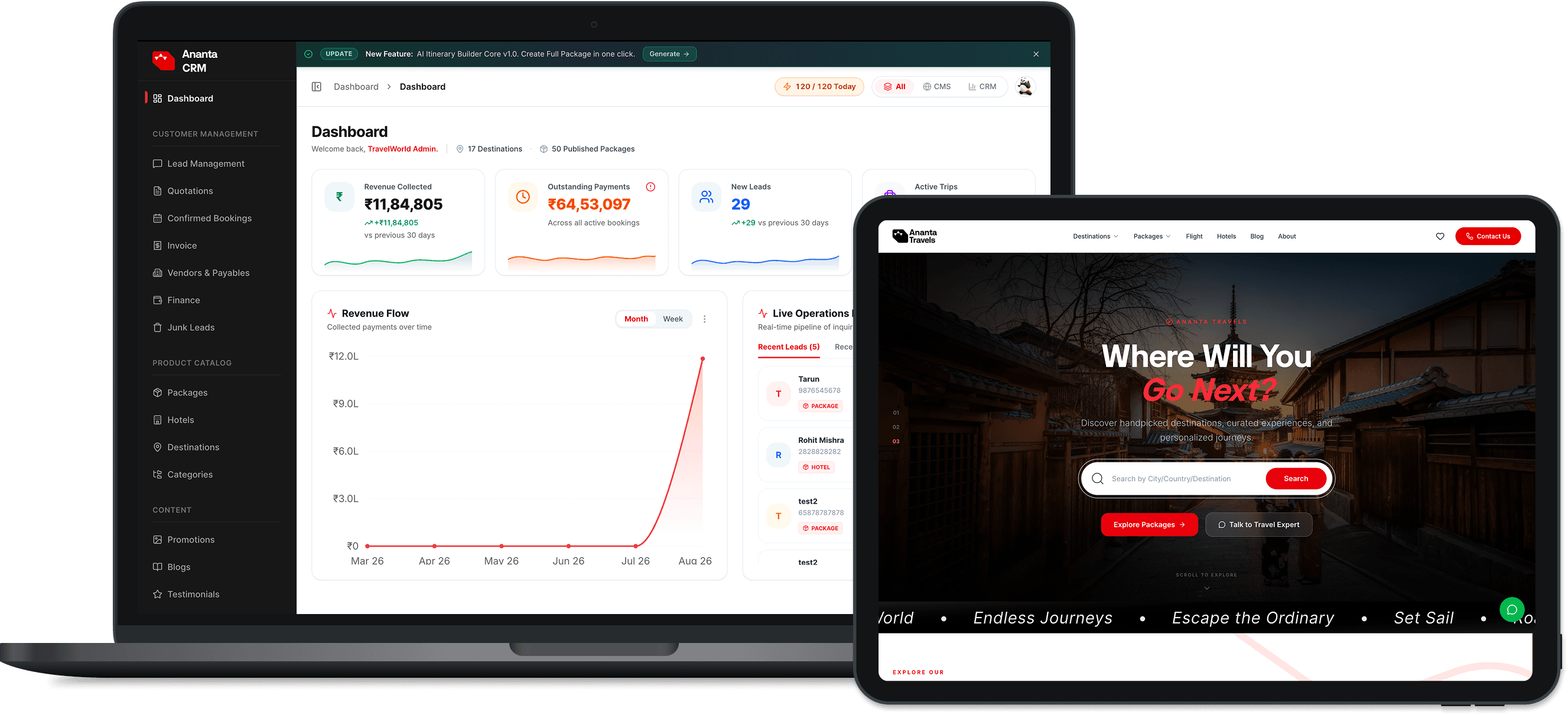

When everything on your screen shouts, nothing is heard. Visitors decide whether to stay on your web application within 3 seconds. If your hero section contains three different colored buttons, five paragraphs of generic marketing buzzwords, and busy floating badges, cognitive overload forces users to bounce. Clean visual hierarchy directs the user's eye naturally toward the single highest-value action.
Buttons labeled 'Submit', 'Continue', or 'Learn More' fail to communicate value. High-converting CTAs are action-oriented and value-first, answering the question: 'What do I get when I click this?'
Sluggish or invisible feedback states leave users wondering if their click registered. Ensure every button has crisp active/hover states, loading spinners on async mutations, and toast notifications confirming successful actions. Additionally, verify that all mobile touch targets meet the minimum 48x48px threshold to prevent accidental clicks.